Skills
UI/UX Designer
Research
Project Manager
Tools
Figma
Adobe Photoshop
Adobe Illustrator
Google Drive
Team
Me (UI/UX Designer)
Derik (Developer)
Brendon (Account Manager)
Project Length
3 months
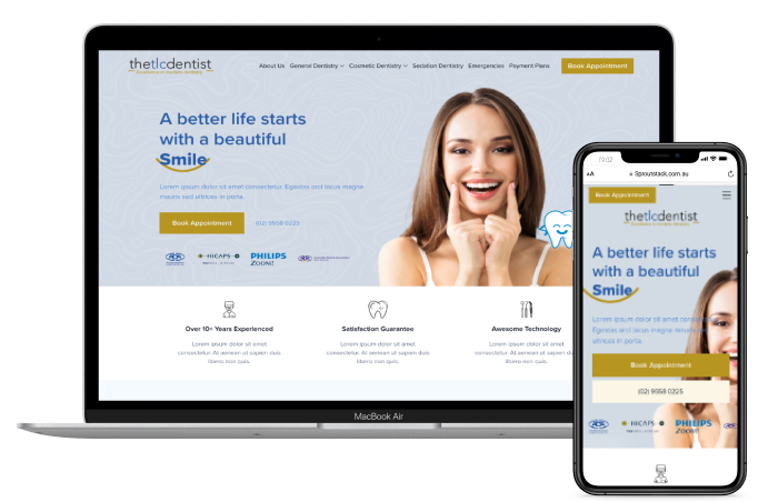
TLC is looking to uplift the design of their website to improve their user experience and upgrade to a more professional interface to showcase their services and offerings, while supporting their additional digital marketing initiatives such as SEO and Google Ads.
The Problem
The website lacks clear information about services, procedures, and prices, making it challenging for patients to understand the options available. Additionally, the website is not optimised for mobile devices, which creates a poor user experience.
The Solution
The goal for this project is to improve the overall experience with the new website design.
Redesign a more user-friendly and visually appealing website
Ensure that website is reponsive across all devices
To improve website ranking and visibility
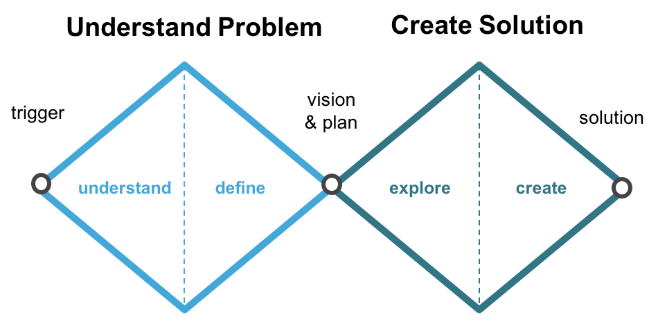
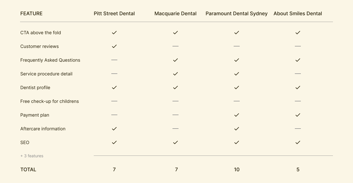
The featured analysis was really helpful in the process, we came up with a lot of opportunities to make better decisions in our design
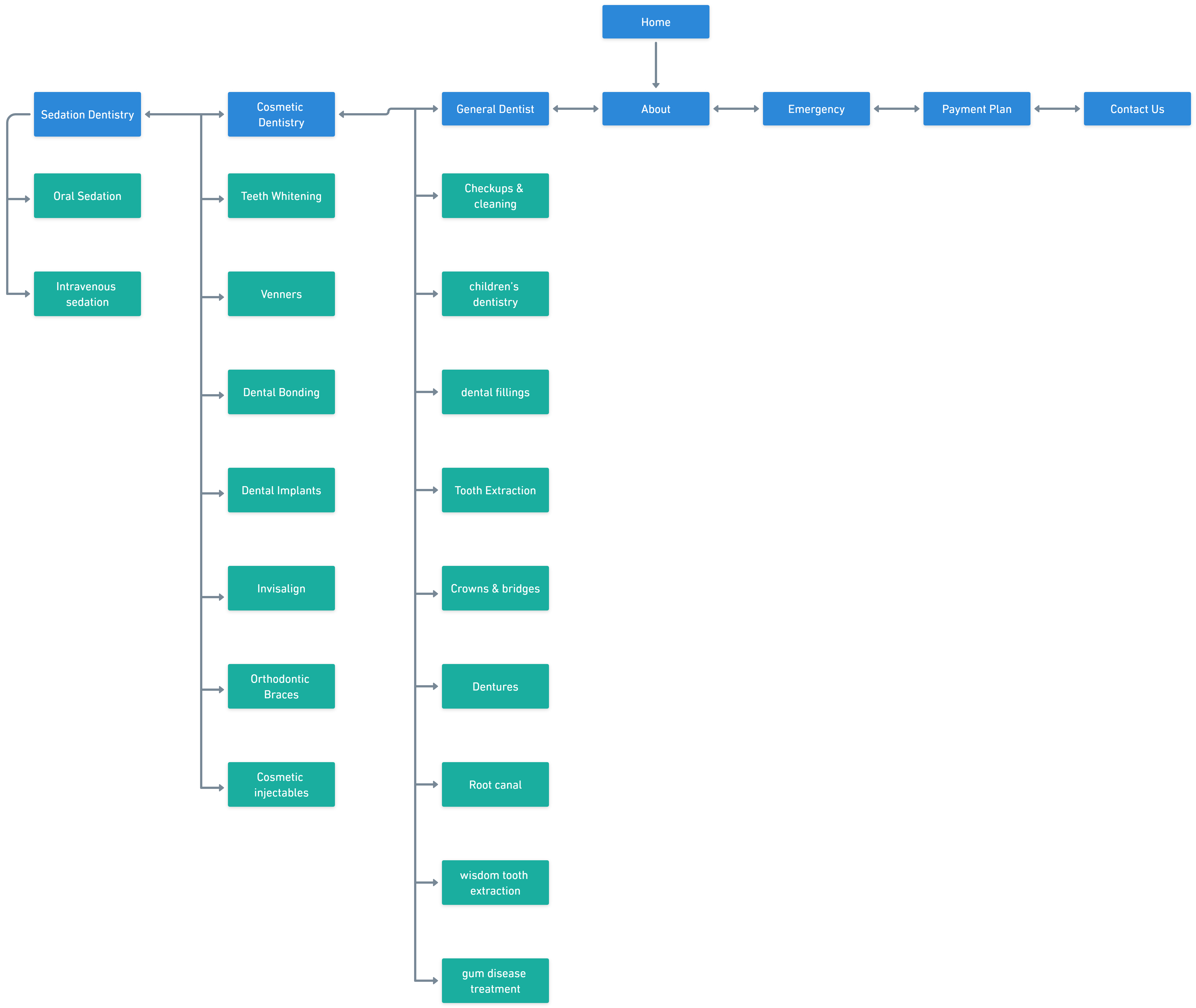
Working with the SEO team to produce a sitemap was crucial in ensuring that all important pages of the website were properly structure to best optimised the user experience and for page page ranking.
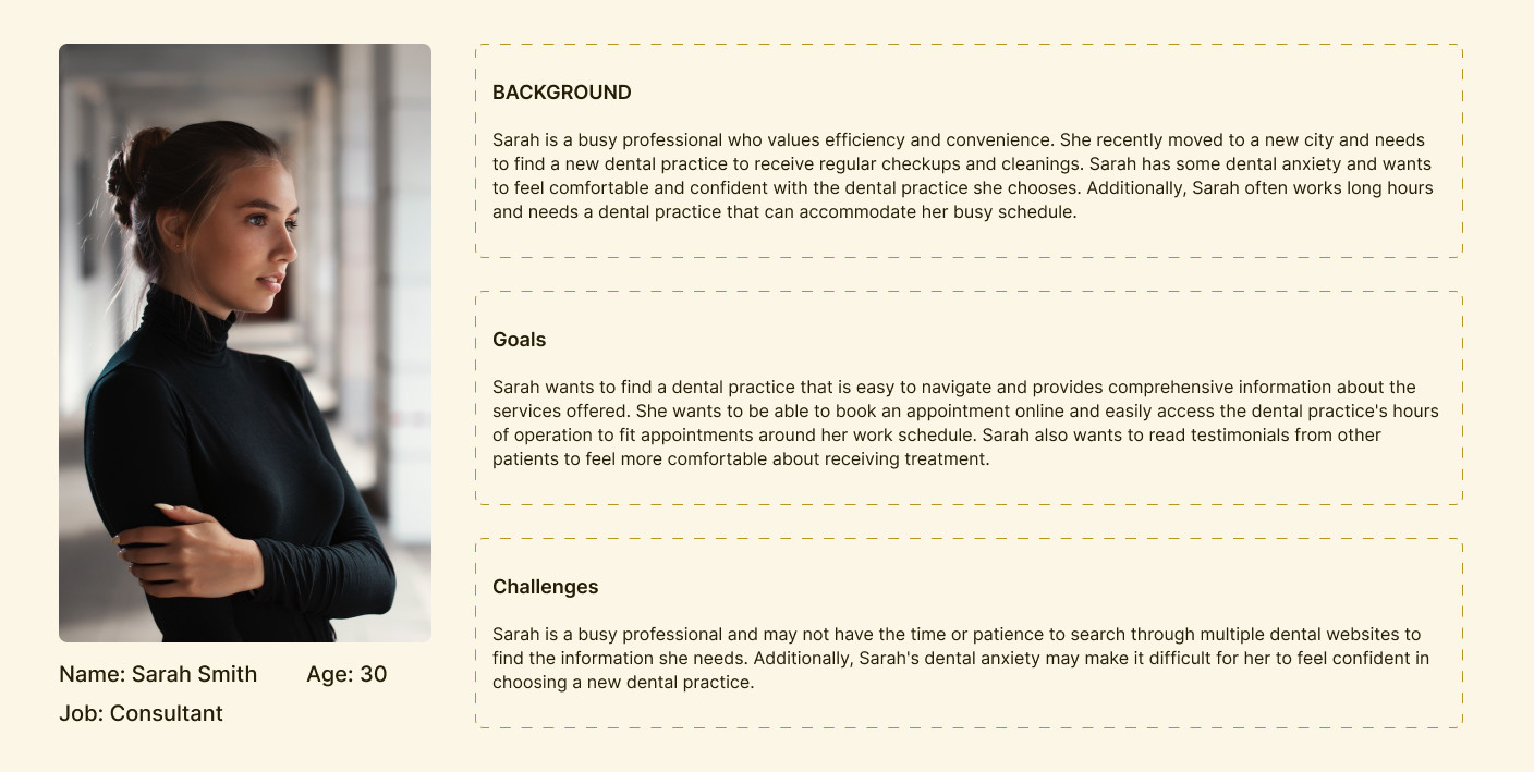
As a new patient, I want to be able to easily navigate the website to find information about the dental services offered and to book an appointment online, so that I can receive dental care as soon as possible.
As a patient with dental anxiety, I want to be able to read testimonials from other patients who have had positive experiences with the dental practice, so that I can feel more comfortable and confident about receiving treatment.
As a busy professional, I want to be able to access the dental practice's hours of operation and make an appointment online, so that I can easily schedule dental appointments around my work schedule.
As a patient with a dental emergency, I want to be able to quickly find the practice's contact information on the website and easily reach someone who can help me, so that I can receive prompt dental care and make the pain go away.
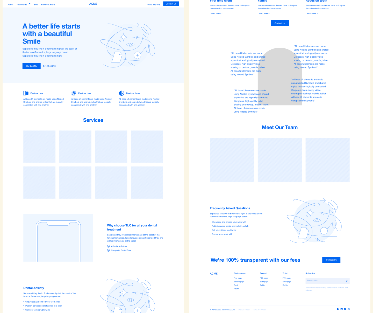
Once I have a clear idea of how the website should be structured. It is just as important to start thinking about the layout of the pages. The page layout should be visually appealing, user-friendly and designed for users to be able to easily navigate the website to find the right information.
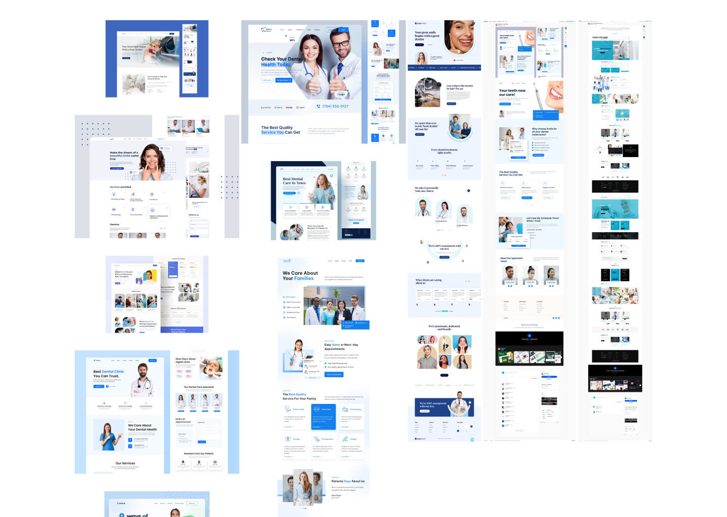
After spending some time looking for inspiration, I ended up with three inspiration boards. However, I decided to show the client just the two boards that I think would work best for this project. The reason behind this was that I eliminate the number of choices the client will have to make and as a result, the client was able to make quicker decisions.
