Skills
UI Designer
Research
Tools
Figma
Adobe Photoshop
Adobe Illustrator
Google Drive
Team
Me (UI/UX Designer)
Derik (Developer)
Kelvin (Developer)
Brendon (Account Manager)
Project Length
3 Weeks
Sproutstack is looking to redesign their entire website as their current website does not accurately reflect the current state of the company, is not user friendly and does not tell the customer who they are or communicate key messages in an effective way.
I started this process by looking for any inspiration that is related to farming, vegetables, fresh produce, organic and modern design from the below websites. The goal was to use this inspiration to create a design direction and decision through the project.

I spend some time going through all the images and graphics to find any visual element that appealed to me and get rid of the one that I don't like.
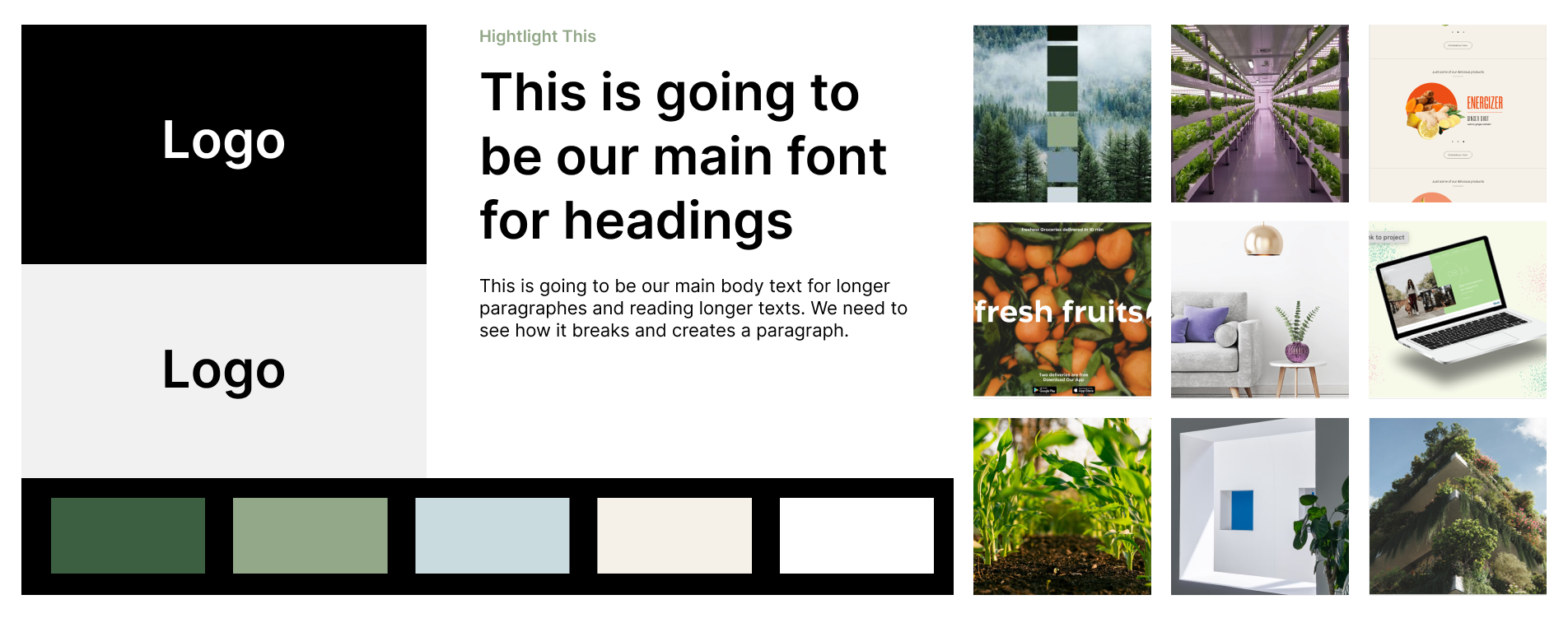
Once, I am happy with my decision. I compiled all these element together to create a brand kit that includes colours, typography and images. This help me to have something that I can always refer back to throughtout the design process for consistent design.
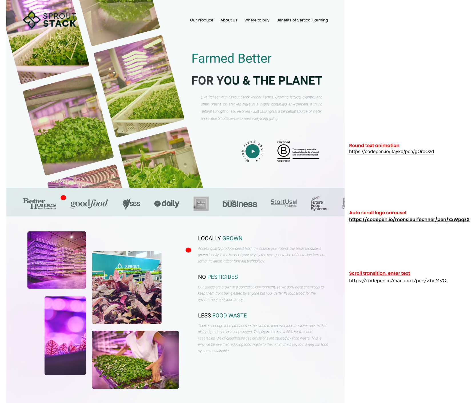
There are a lot of animations that is happening for the project, so it was very important for me to work closely with the developers for us to be on the same page and they can create the animation that I have planned. I used a website called codepen.io to look for the animation that I want and left notes in the Figma file for the developers to see.
