Skills
Product Design
User Research
Market Research
Tools
Figma
Adobe Illustrator
Google Drive
Team
Me (UI/UX Designer)
Kelvin Balayut (Developer)
Angelo (Account Manager)
Project Length
2 Weeks (Design + Lauch)
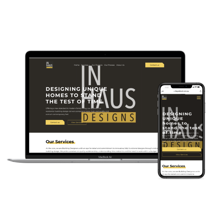
InHaus Interiors is a dynamic interior design firm focused on building personalised interior for home owners. Inhaus Interior is a sister company to an existing business called Inhaus Design.
The Problem
The interior design company is experiencing a significant loss of potential business leads as a result of their lack of an online presence. Hence, the company is losing opportunities to showcase their expertise and attract potential clients, ultimately hampering their growth and ability to remain competitive in the market.
The Solution
The goal for this project was not to just build them a website but we also need to think about how we can bring traffic to the business.
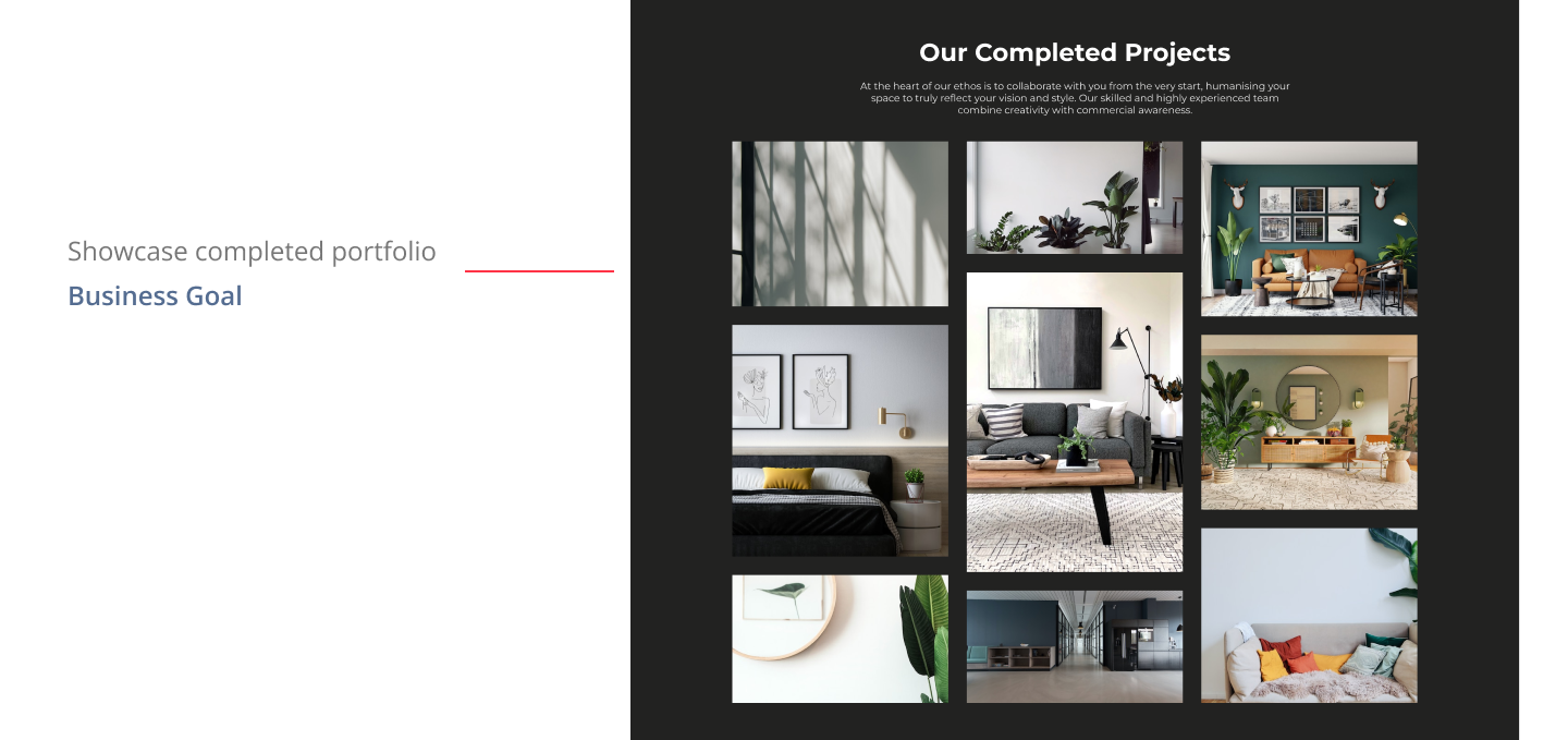
Showcase the company's portfolio of completed projects
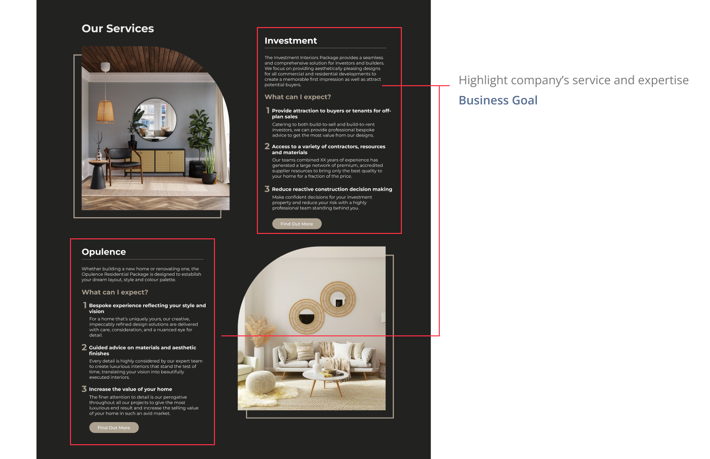
Highlights the company's services and expertise in interior design.
Make the website mobile friendly
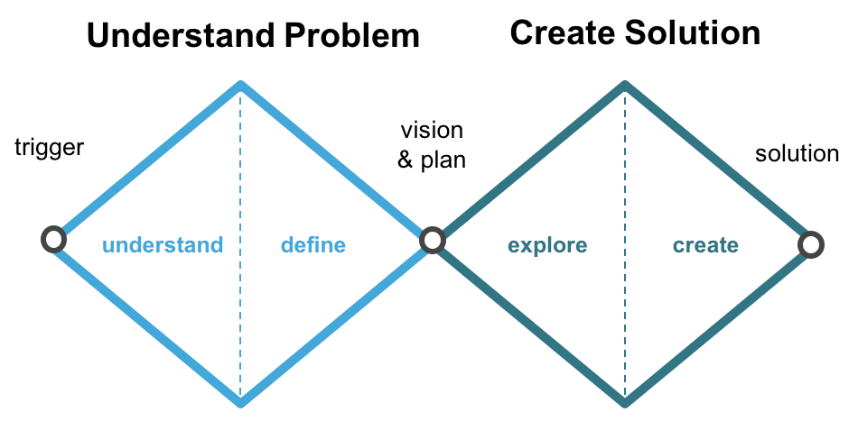
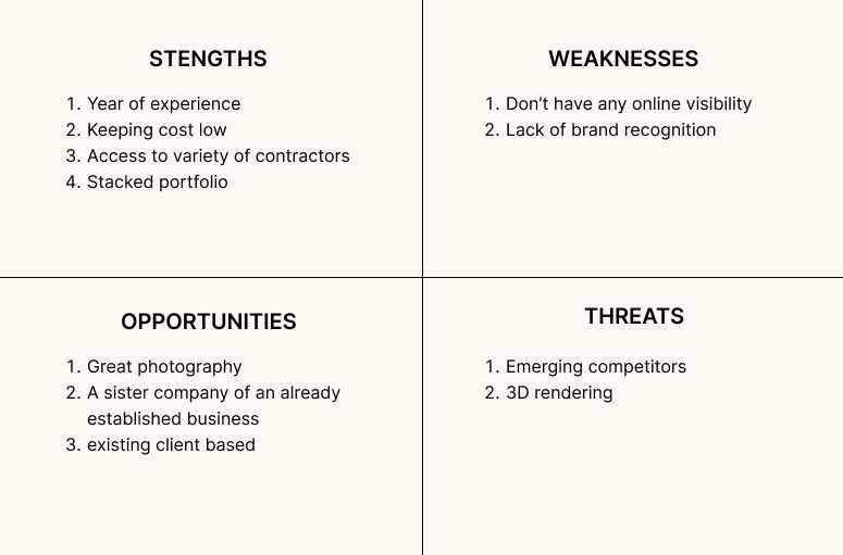
Due to the client's request for a fast turnaround time for this project and the client has busy schedule. I needed to quickly understand the business, the users and the goal of the project. I completed a desk research on the competitors and noted down a few points to present to the client.
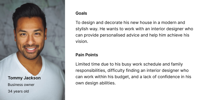
Since the client is very busy, I quickly came up with a few designs with the aim to get as much feedback from the client as possible. I wanted to make sure that we are on the same page with the visual direction (design + moodboard) of the design so we can finish this project in two as per the client's request.
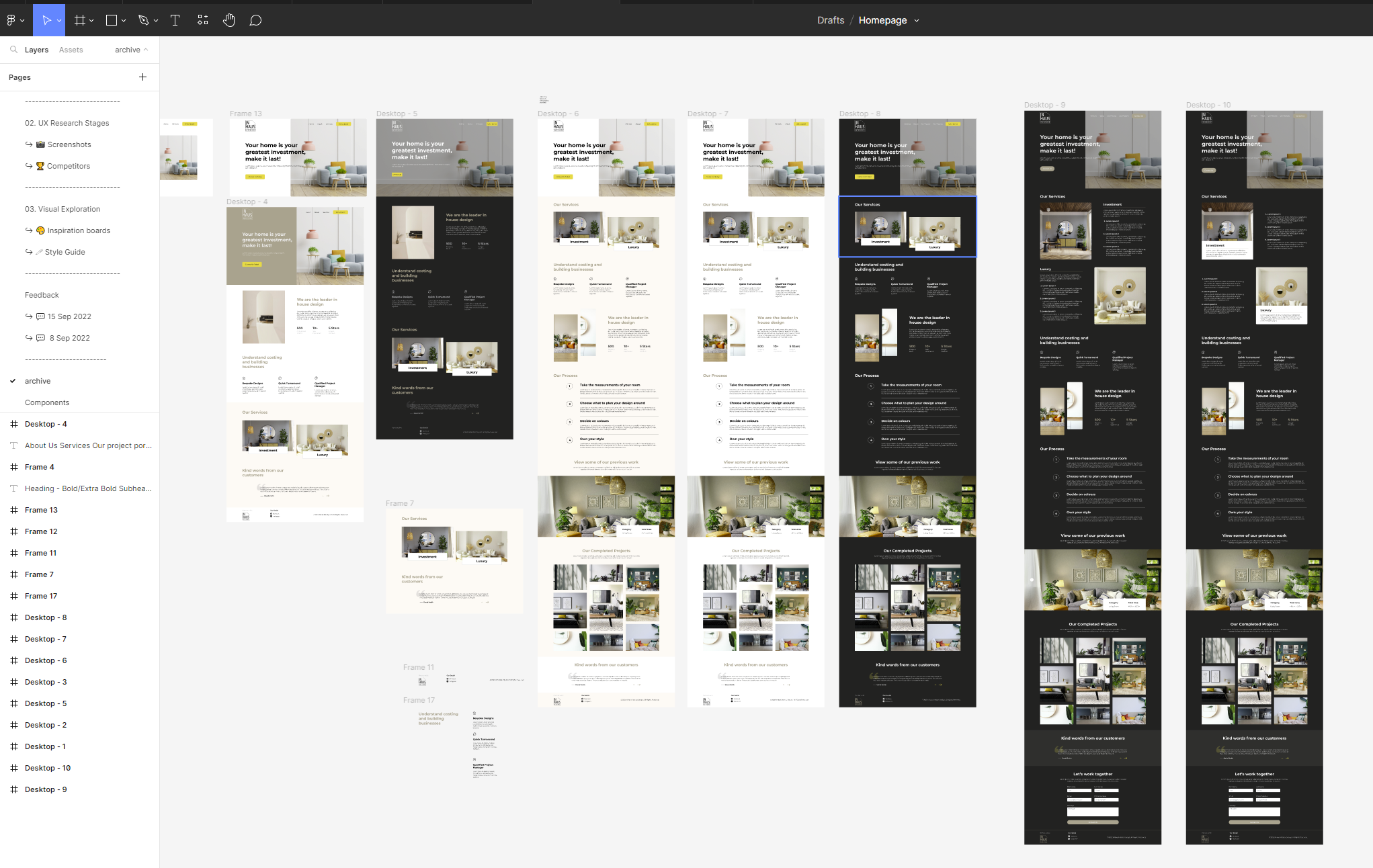
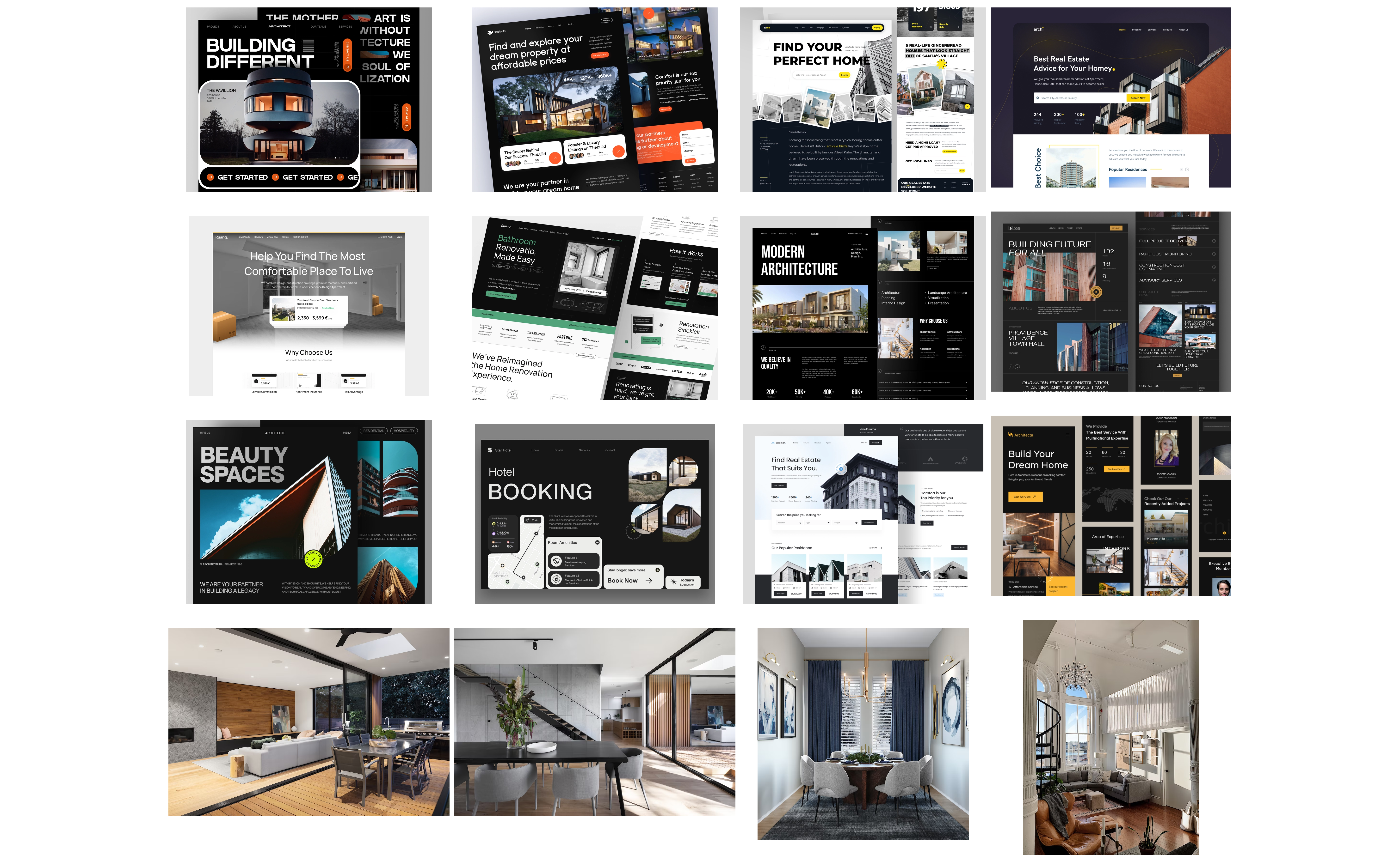
Here are the key takeaways after talking and receiving feedback from the client.
The client wants to focus on informing their target audience about the company brand and its values.
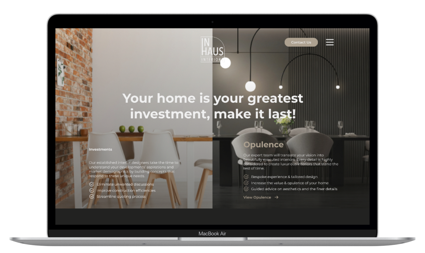
Highlight the two services offered: Investment and Opulent
Display their unique process and approach for each service
Want the website to feel luxurious
To associate their sister company (Inhaus Design) to the website.
I put together a design system to speed up the design process before I started working on the design of the website. The colours were inspired by their current logo design.
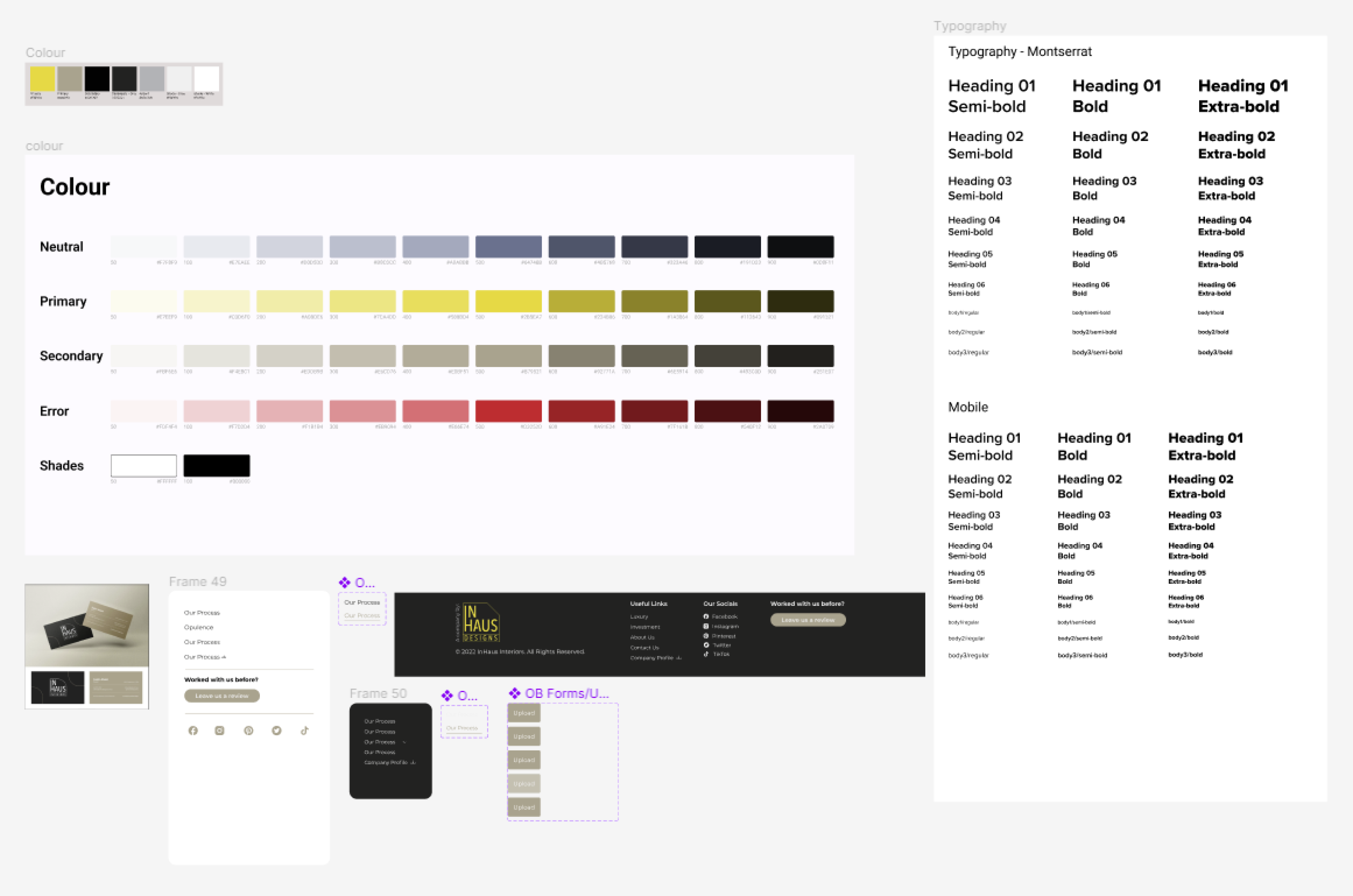
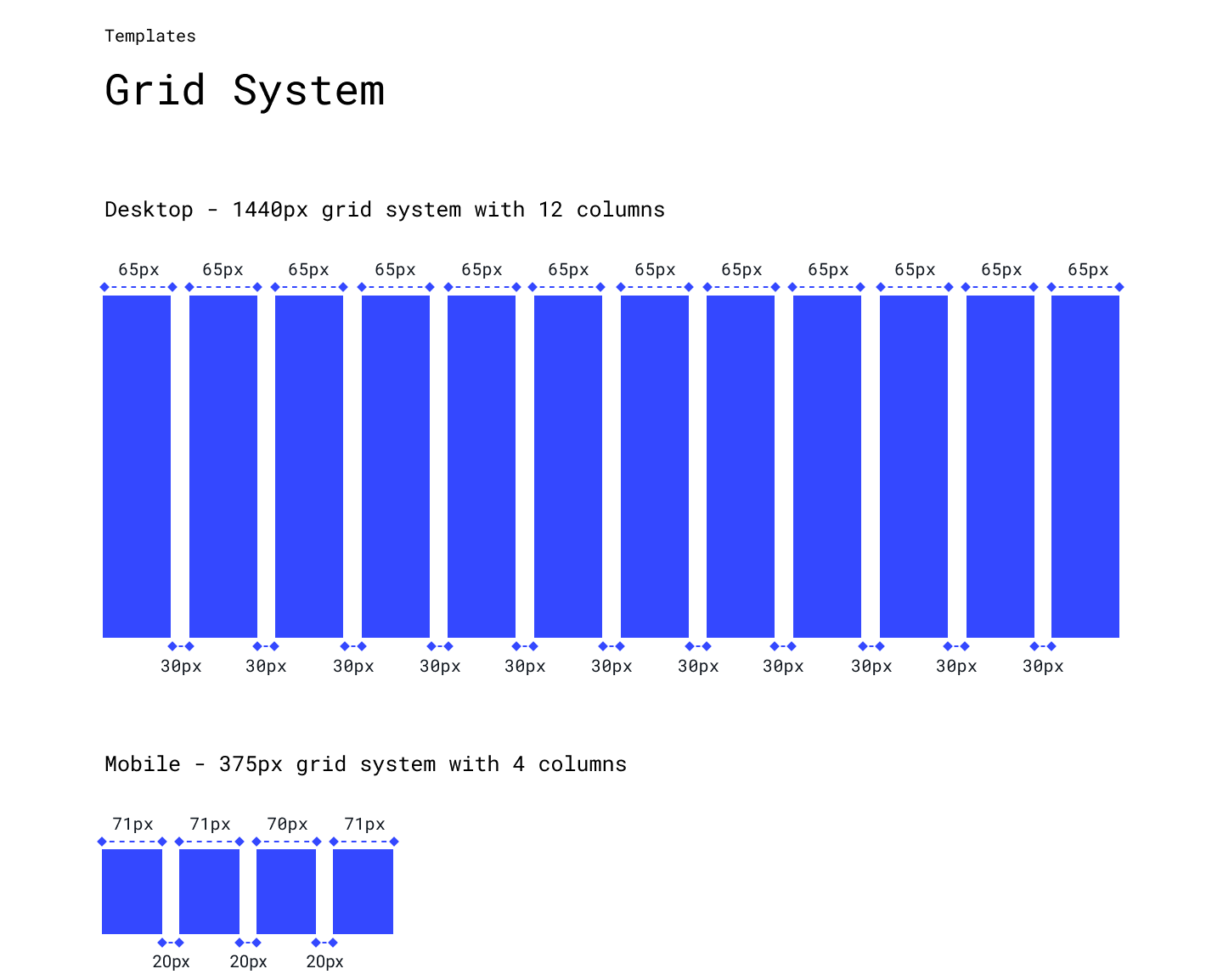
Due to the time constraint of this project, I have to work very closely with the developer and clearly communicate any ideas that I have. I used codepen.io to find the right animation to provide the developer with what I had in mind.
This is the first time I needed to finish a project in this short amount of time. Finding the best/most effective ways to utilised all the time that I have with the client was very crucial.
I need to reduce the number of tasks require from the client. for example, instead of giving the client 3 or 4 mood boards to choose from, I can make the initial decision by only presenting the 2 mood boards that I think work best for the project to the client. This will likely make it easier for the client to make the decisions.
Scheduling the time to sit down with the developer to ensure he understood the project completely. This means he can develop the website quicker with minimal feedback sessions.