Skills
Product Design
User Research
Market Research
Tools
Figma
Team
Me (Solo Project)
Project Length
2 Weeks
Maynooth Furniture is a new business selling affordable high-end design furniture made in Ireland. The owner wants to build an e-commerce website for people to browse & purchase furniture for home delivery.
Maynooth is currently experiencing a 50% drop-off in sales from the business due to the current Covid-19 lockdown situation. The owner decided that now it is the right time for him to invest money into building a website for his business.
The solution and the designed decision were made after conducting surveys of 10 potential customers to understand how they would want to browse the website and what they want to see on the website.


To get a better understanding of what makes a great furniture e-commerce website. I researched the competitor's websites to learn the ins and outs of the industry and identify potential opportunities where I can bring to the business.
Determine what products the competitors offer.
Take a look at competitors’ pricing and delivery cost.
Observe how they promote their products.
To understand why customers shop online and reasons why they choose the particular store website. I surveyed 10 people to understand what is special about the website that makes them want to shop there, how they first discovered the website, their first impression of the website and what they don’t like about the particular website.

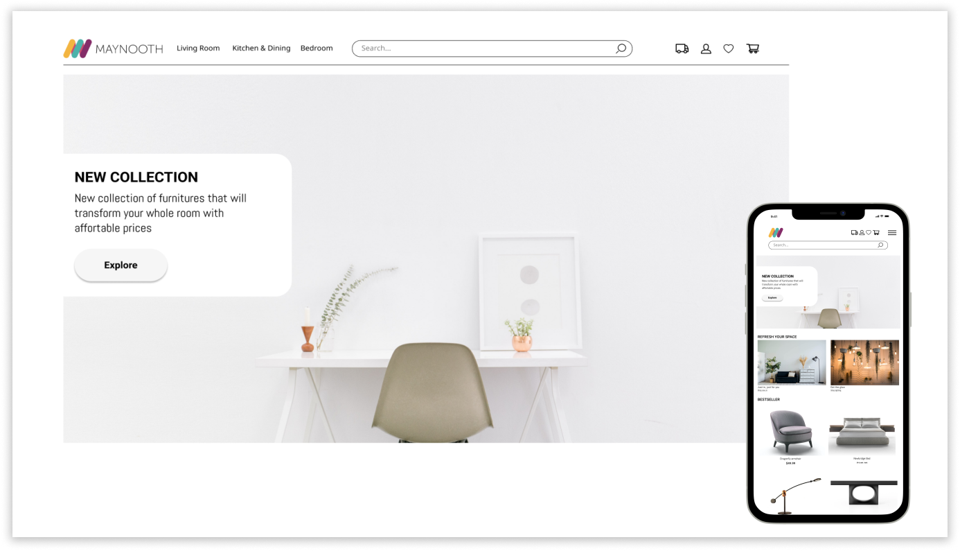
Keep it simple and minimalistic, a lot of furniture stores clustered the website with too many images. As such, I knew that I should take a minimalistic approach and also taking mobile user into the consideration.

Customers want to be able to track the delivery. There are numbers of reports where the delivery doesn’t arrive on time. I decided to include tracking in one of the pages to increase customer satisfaction with the service.

The customers are interested in looking for new ideas and inspiration. This is the reason why customers revisit the website because they want to look for new ideas. This will also increase the conversion of the business.
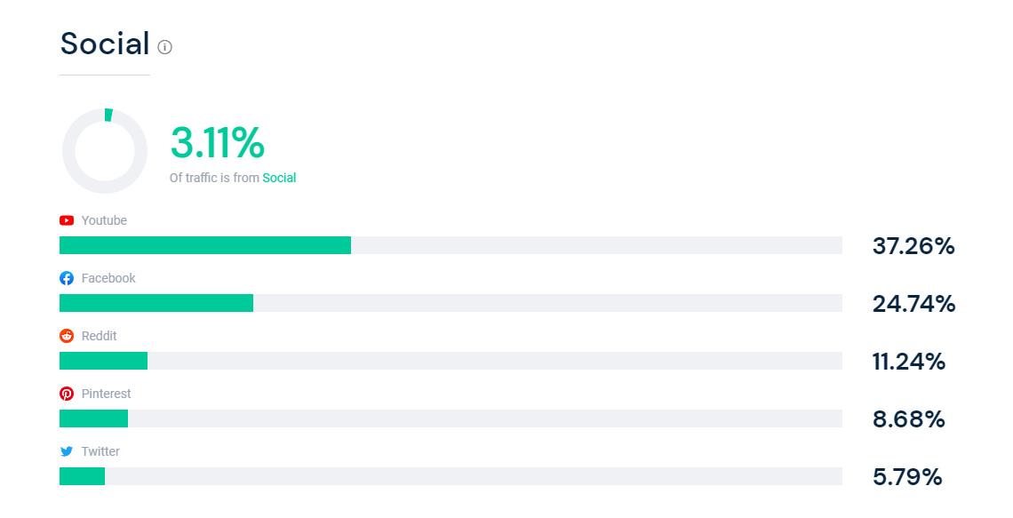

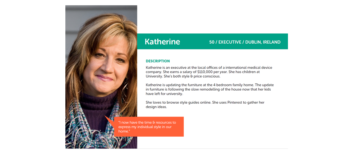

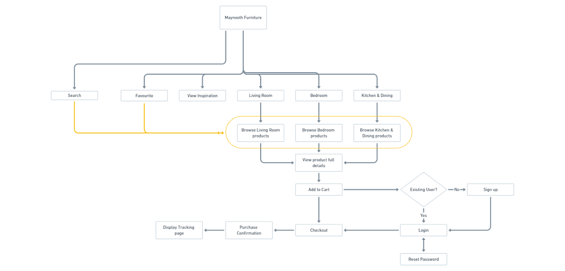
With better idea understanding of how the user will use the website. I conducted a card sort to gain insight as to how users might expect the content to be organize and displayed and used this result to create a sitemap.
Since we want to create a minimalistic look, I wanted to focus on having all the key findings from the research stage displaying on the screen and make them the highlighting feature of the website. I started with pen and paper wireframes and created multiple versions of each screen. I also welcome any idea or feedback from the product owner at the point.
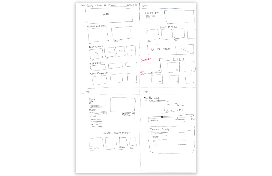
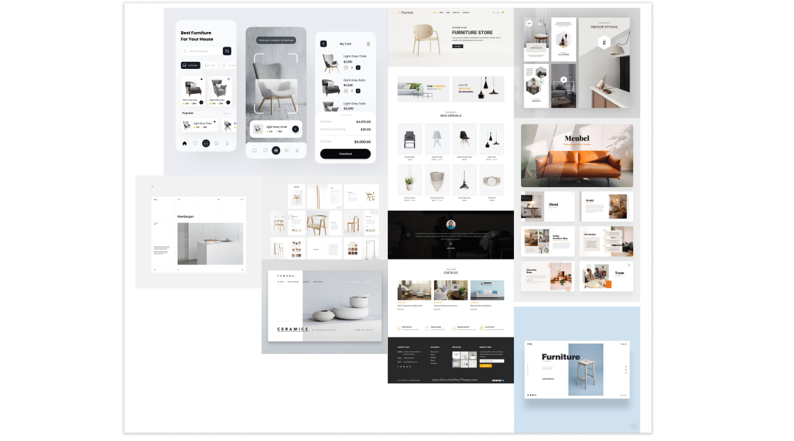
This phase was the game changer - by conducting usability tests, I was able to refine what users were finding useful, and completely change up what they didn’t react well to. The users were asked complete a few scenario-based tasks that would test the main features of the app, and were asked how they felt about the app in general. The results of the usability tests were recorded and analysed using affinity map.
Users were able to complete tasks quickly
Users enjoy the simplicity of the website
Users was able to find information quickly
Users found text a little too big
Having to click on dropdown to see colour options
Images display on mobile is too big and required a lot of scrolling
I made the changes based on the user feedback and then I reached out to the product owners and present to them with the new changes and explain why I made the design changes.
I redesign the website layout on mobile by having two images displaying in one row instead of one large image. This allows the users to view more items and not having to scroll as much.
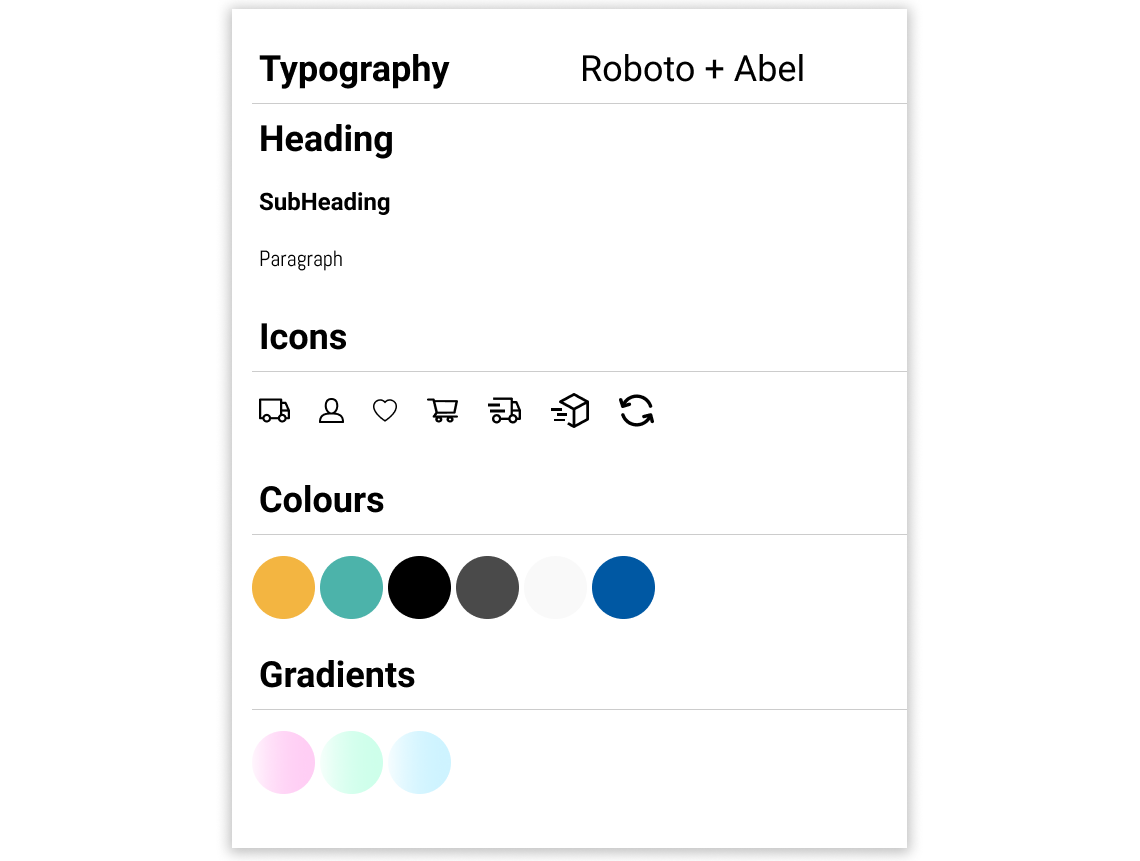
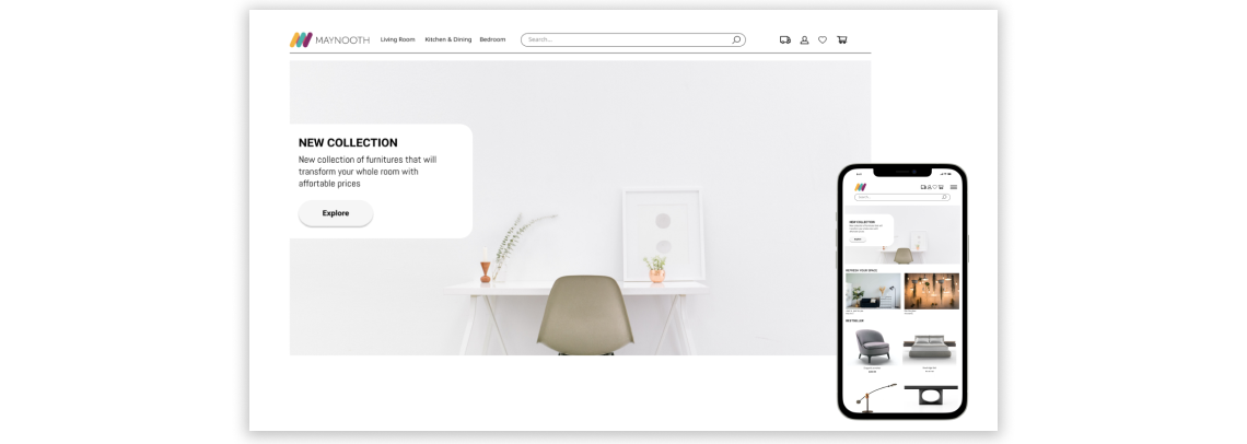
Wants and Needs: Need to become better at differentiating between what are the wants and needs.
The biggest challenge was getting the right sizing and the amount of information to display on the page. Different white spacing enhances visual aesthetics and improve readability