Skills
Product Design
User Research
Market Research
Tools
Adobe XD
Team
Me (Solo Project)
Project Length
2 Weeks
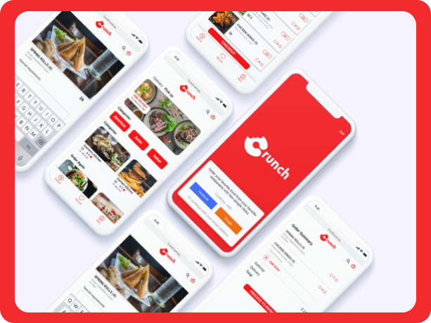
Crunch is a food delivering app that connects you with a broad range of local restaurants and food, so you can order food from the full menus of your local favourites restaurants with just a few simple clicks whenever you want.
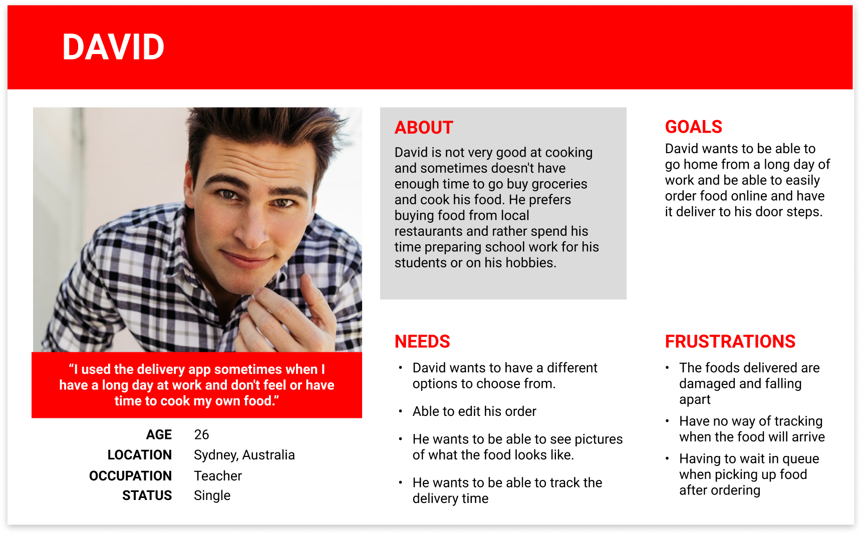
Our user requires a method for ordering food to be delivered to their home. They want to be able to order food from their favourite restaurant and have it delivered right to their doorsteps. The product owner wants their service to have a better reputation than the competitors.
Users need a convenient way to order food from their favourite restaurants and have them delivered to their doorsteps in a timely manner. The success of the app will be measure by the amount of 5 stars reviews in the app stores.

I conducted a competitive analysis on other popular used food delivery apps right now to analyse their marketing strategy. I wanted to find out the methods used to attract users, users' opinions on these services and looking for opportunities to help Crunch grow.

The marketing strategy is focused on Direct with 63.96% of traffic coming from this channel, followed by Search with 32.18%
I did some research online to see what people have to say about the delivery apps and I also conducted interviews with 5 different people to see what they have to say.
Key Finding: Based on the research online and interviews, the main problem with food delivery apps is maintaining the quality of the food during the delivery process. The apps with a time tracker displaying when the food will arrive at the doorsteps are the ones with the most satisfying customers.
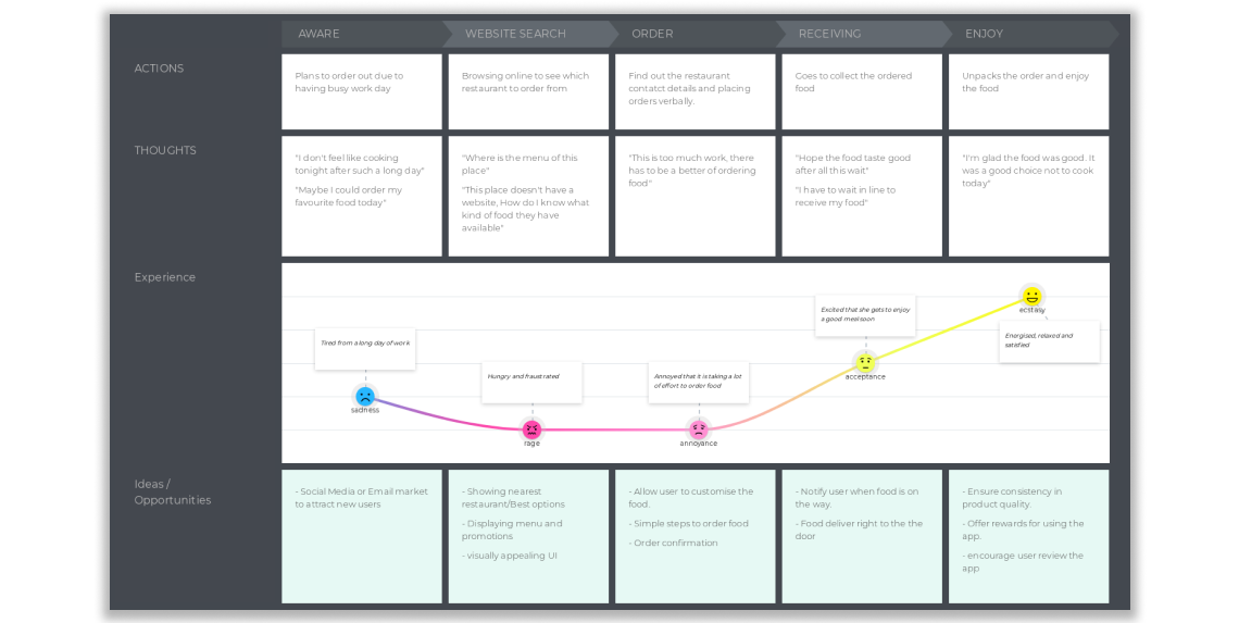
I produced a customer journey map to have a better understanding of the user and to come up with a plan of attack. I contacted a few friends who commonly order take out. However, I was surpirsed to learned that many local restaurant still don't have access to any existing food delivery systems.
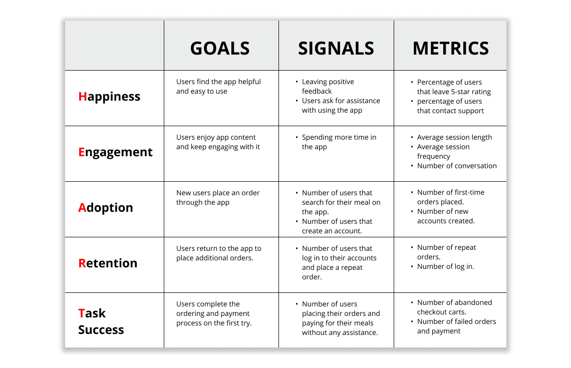
I began outlining how success would be judged after I had a better understanding of the situation. To achieve this, we were advised to combine Google's HEART framework with the Goals-Signals-Metrics (GSM) methodology to guarantee a shared understanding of what success entails.
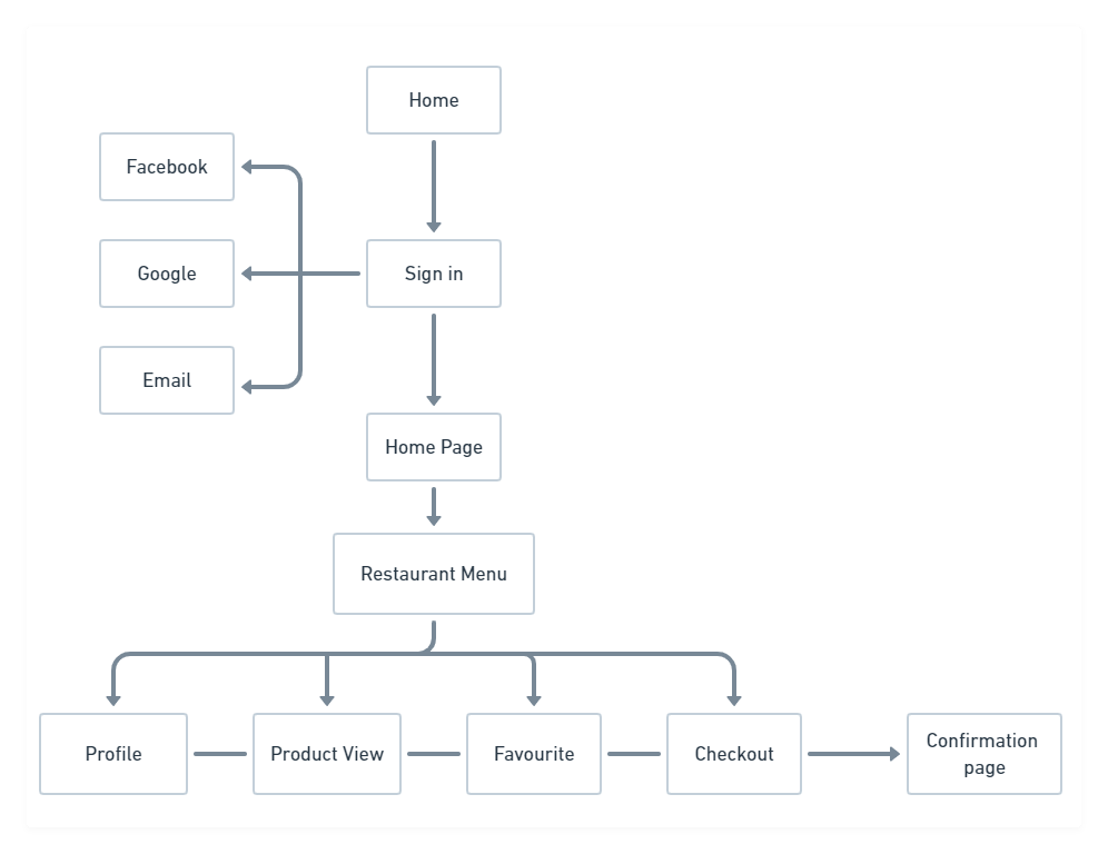
I created a sitemap of how the app will work to get a better idea of how the app will work. During this step, I did a lot of brainstorming and deciding on what is important and needed to be included in the app. I had to refer back to the persona and user journey map to remind myself of what I need to build to achieve business success and meet the user's needs.
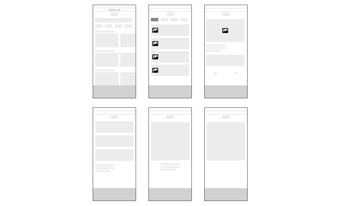
After completing the research and interviewing the user and have established the wants and needs from the users. I started ideating low-fidelity wireframes to come up with a few ideas.
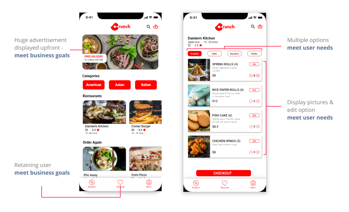

Assume Less: Need to remind myself going forward that I am building a product for the users. I need to focus on what the user wants and needs. Must design based on research and not my assumptions. This could have saved a lot of time redesigning the app.
I learned: I learned that it is important for the UI designs to make the prototype look more realistic. Such as adding a keyboard pop-up when the user is typing. A cool welcome animation.